Ripple Medicine
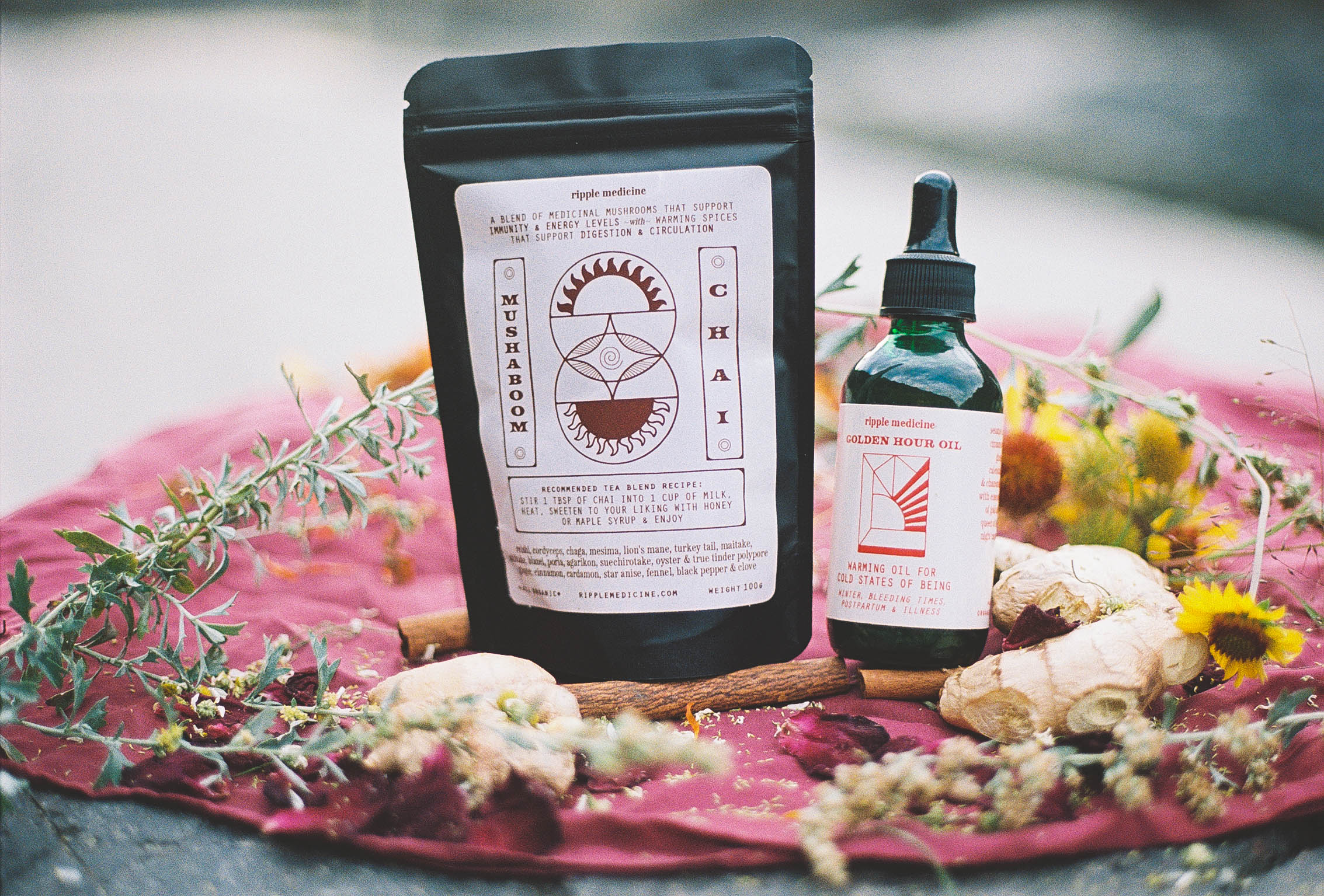
Ripple Medicine is rooted in the strengths of seasons, elements, and plants. Honoring wholeness and offering nourishment wherever we are on our path. Lauren MacDonald is a licensed nurse, a trained birth, postpartum and abortion doula. She offers generative health support to families and individuals in pregnancy, labor, birth, postpartum, fertility, surrogacy, bereavement, termination and menopause.
I had the honor of creating new labels for her herbalism offerings – a delicious chai tea blend and a warming topical oil. I created custom illustrations for each product and sucessfully fit large amounts of information and ingredient lists onto the small-sized packaging.


"Emily's graphic design creation has been such an asset to me as a small business owner. I felt compelled to work with Emily because her artistic expression uniquely wove with her precise design skills in her portfolio. The labels I have received feel like works of art within informative and clear packaging. Emily's communication and care was professional and easeful. She was thorough with her steps and processes and confident in her delivery of products. I am so grateful for her service and technique. I am looking forward to our next batch of labels and collaboration." - Lauren MacDonald
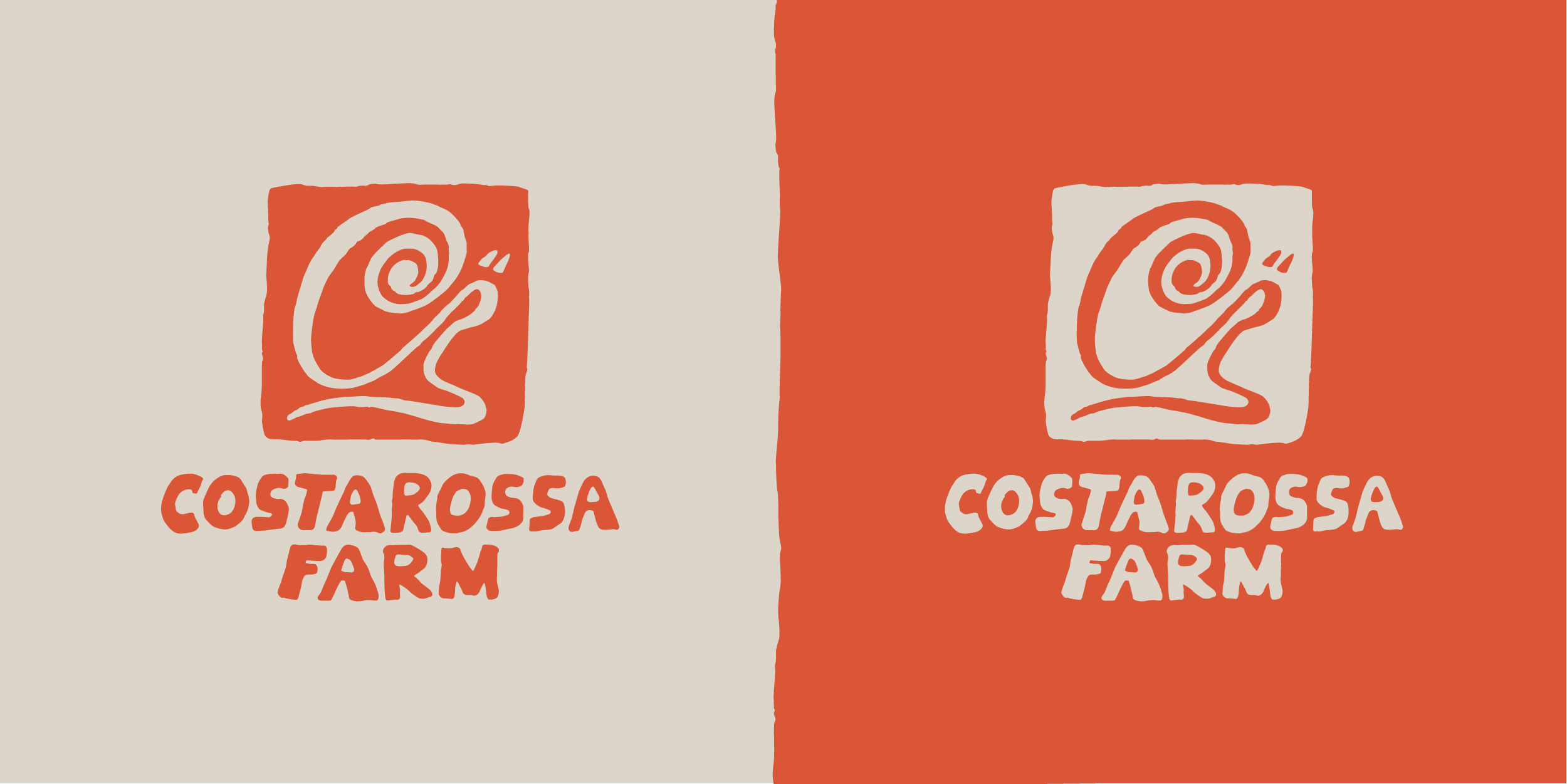
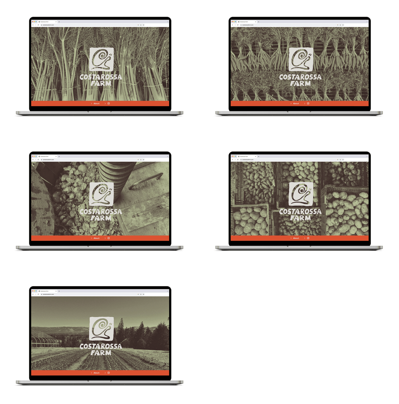
Costarossa Farm is an organic vegetable and flower farm located in Hood River, OR. They also grow pear and cider trees and produce their very own hard cider. I designed their logo – a whimsical snail made up of the “C” and “R” letterforms and a custom hand drawn font. They wanted the logomark to feel like a tag that they could easily write on crates and boxes of veggies that are delivered regionally to various markets and restaurants. We used the logo as the label artwork for their very first batch of hard cider.
Much more on the horizon for this fun creative collaboration – stay tuned!


Sustain

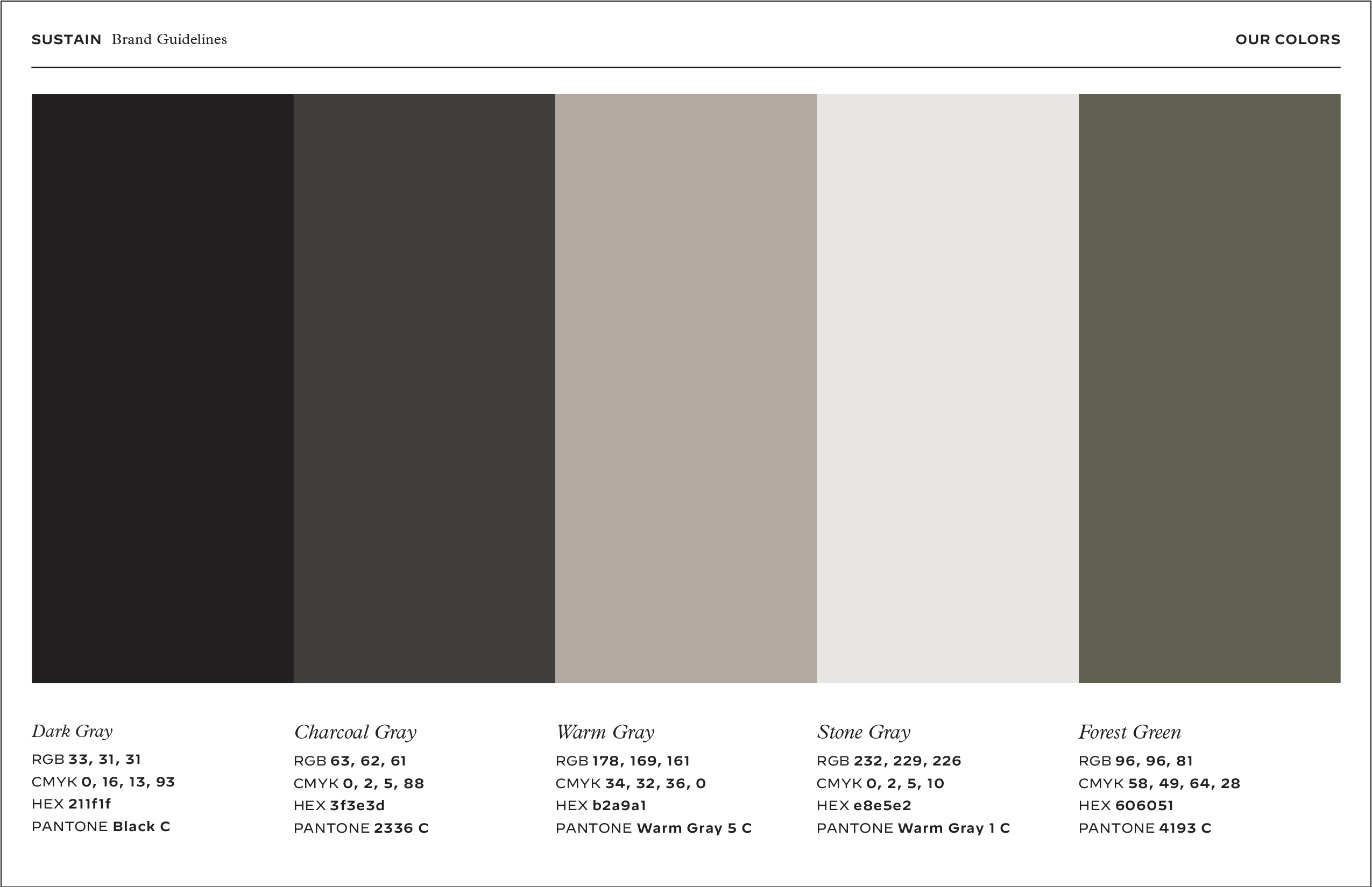
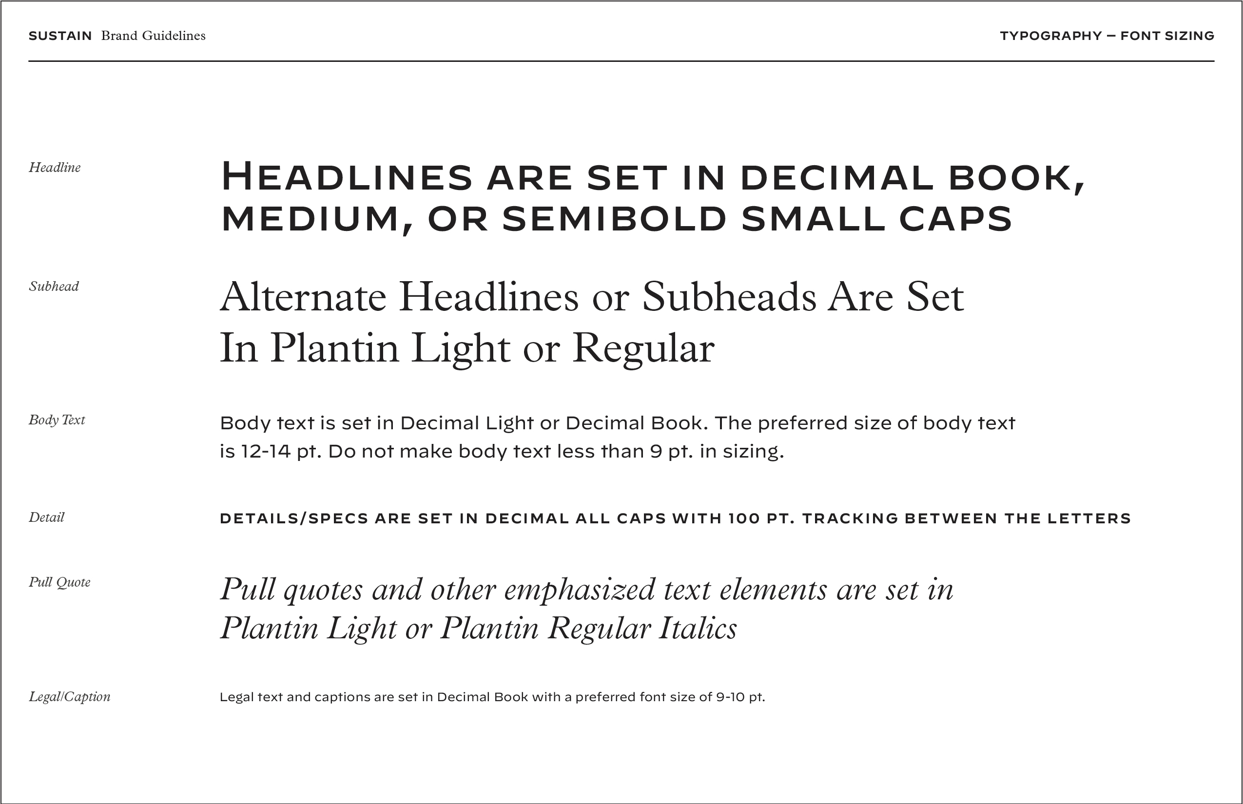
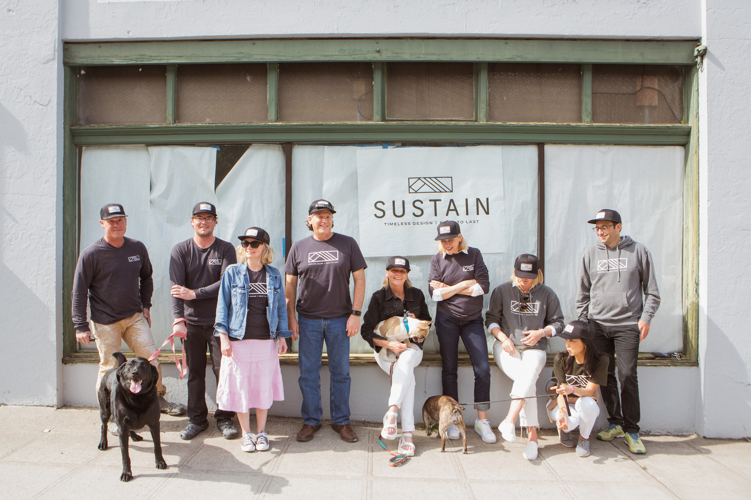
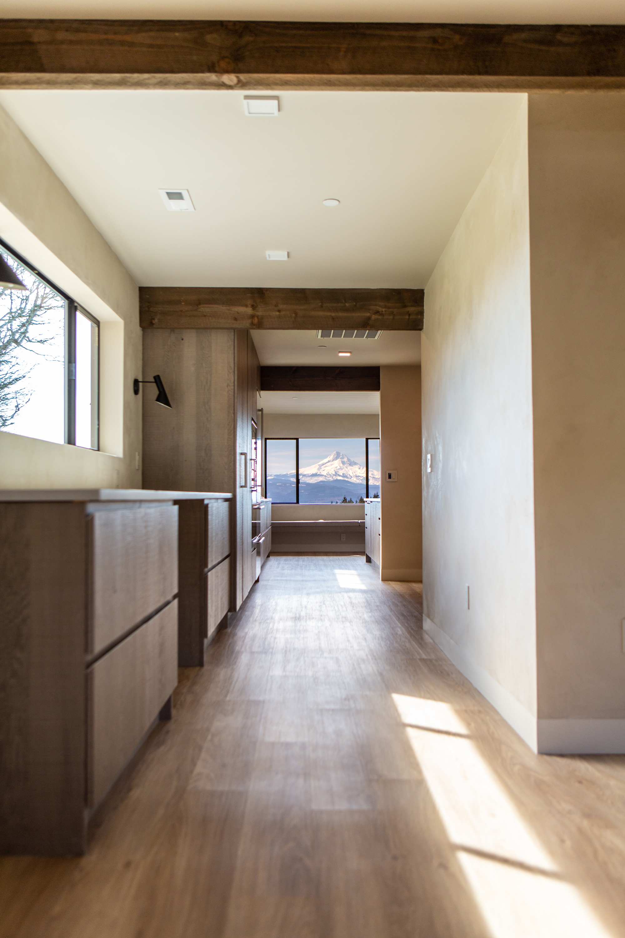
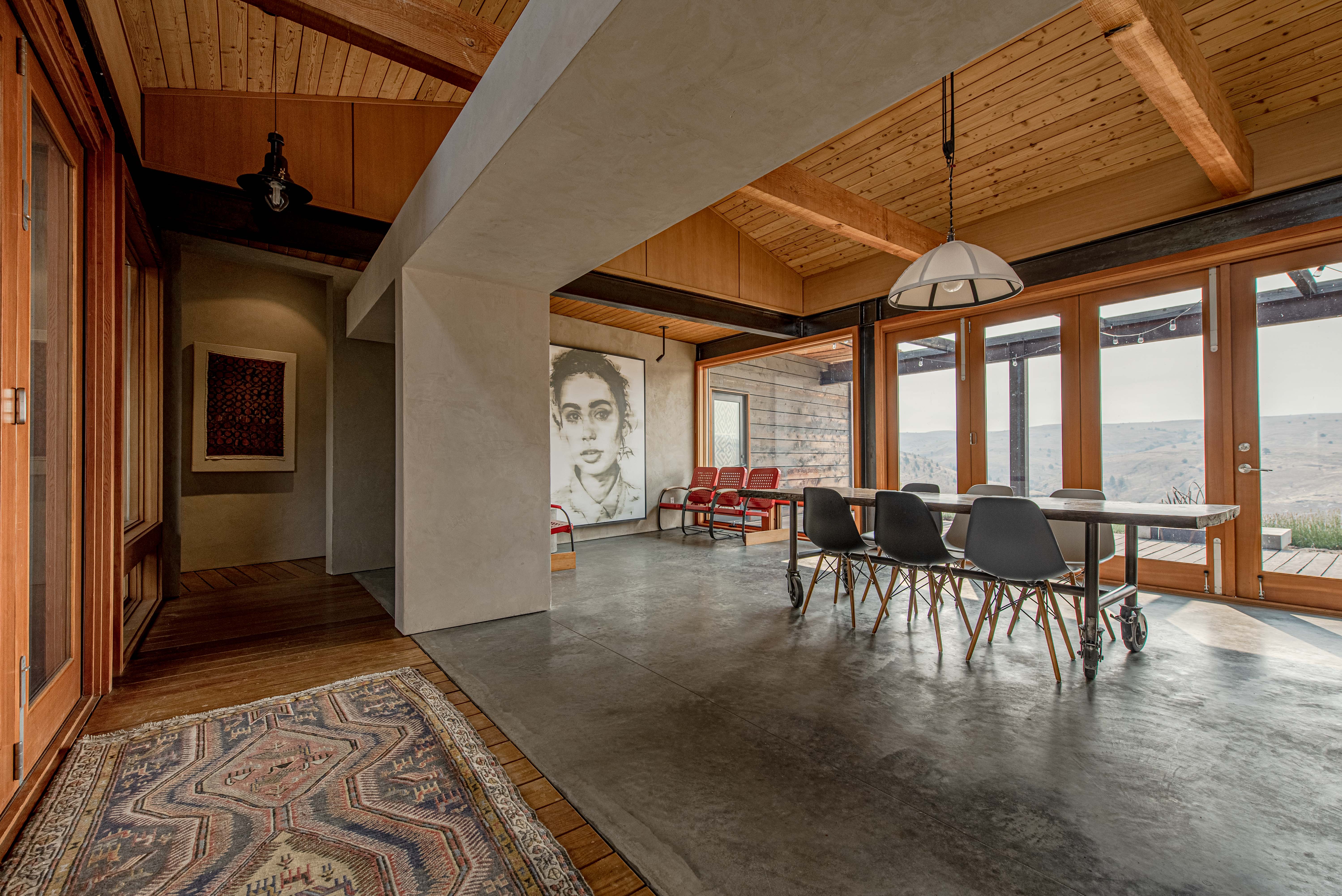
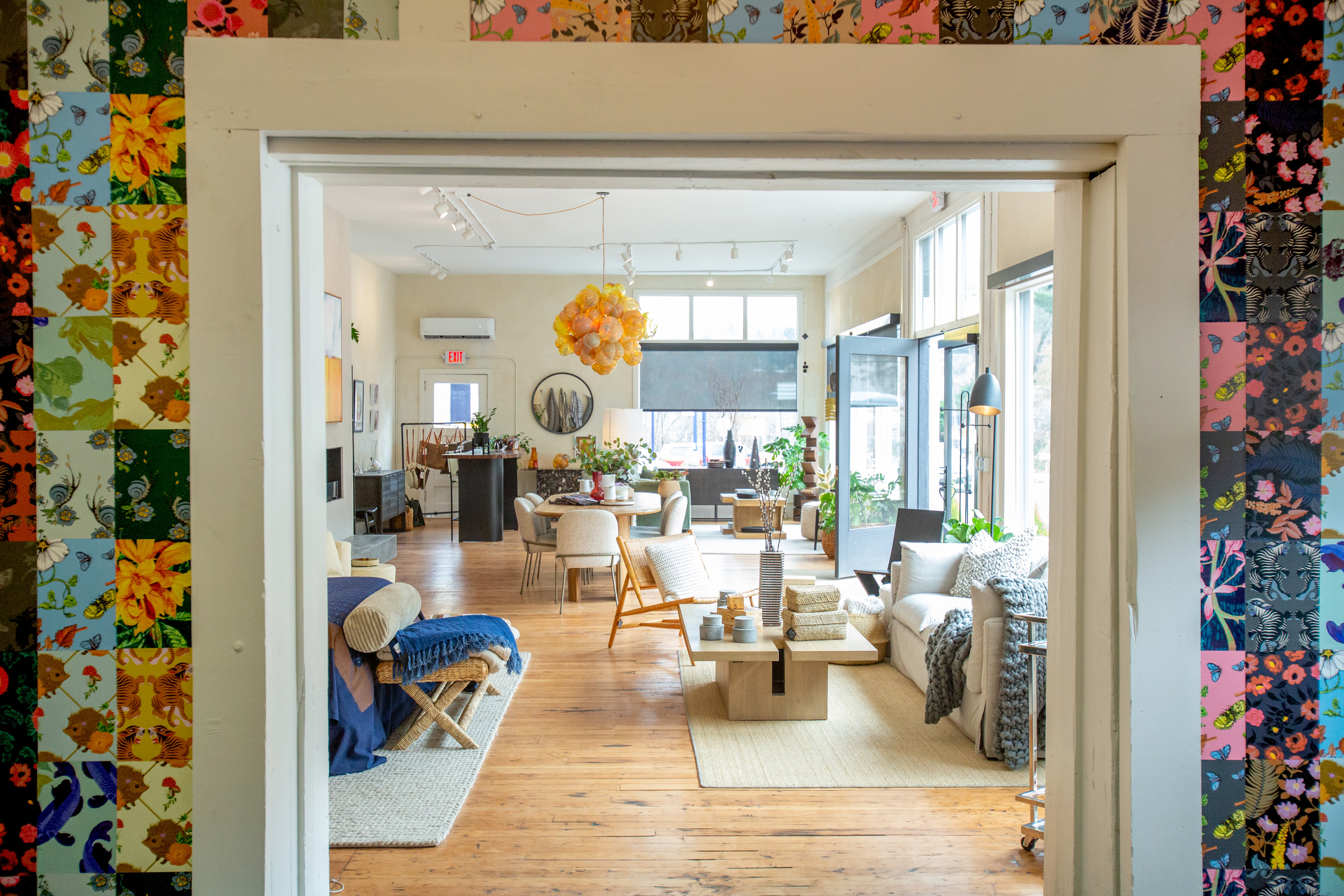
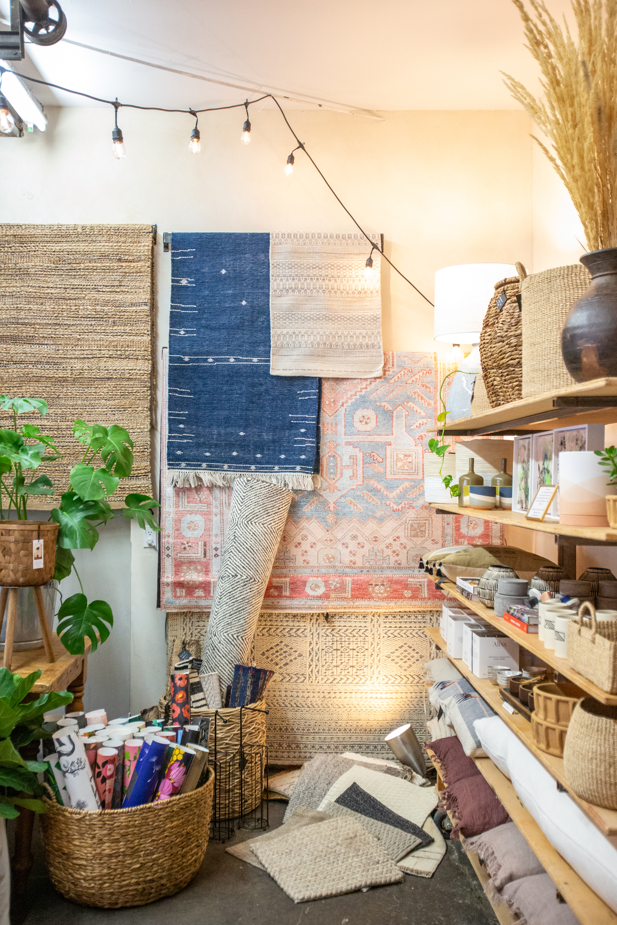
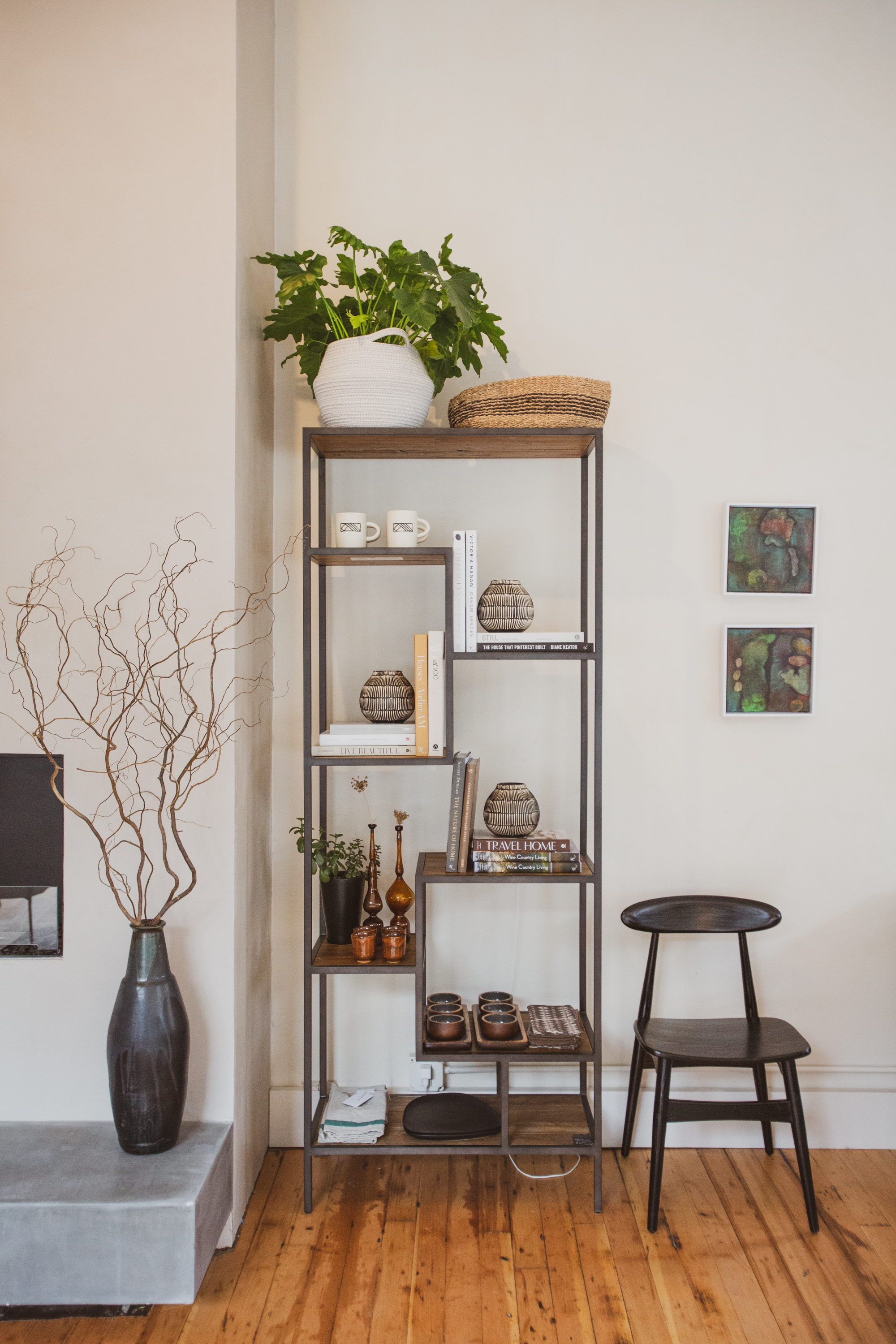
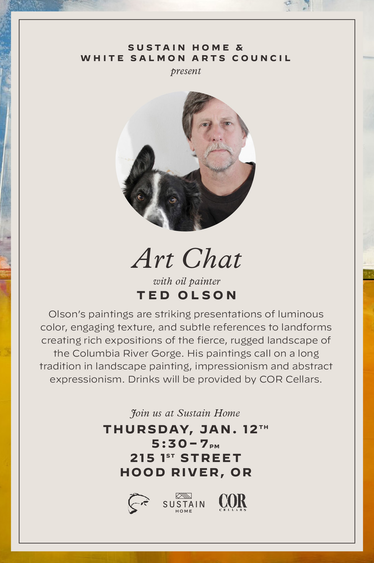
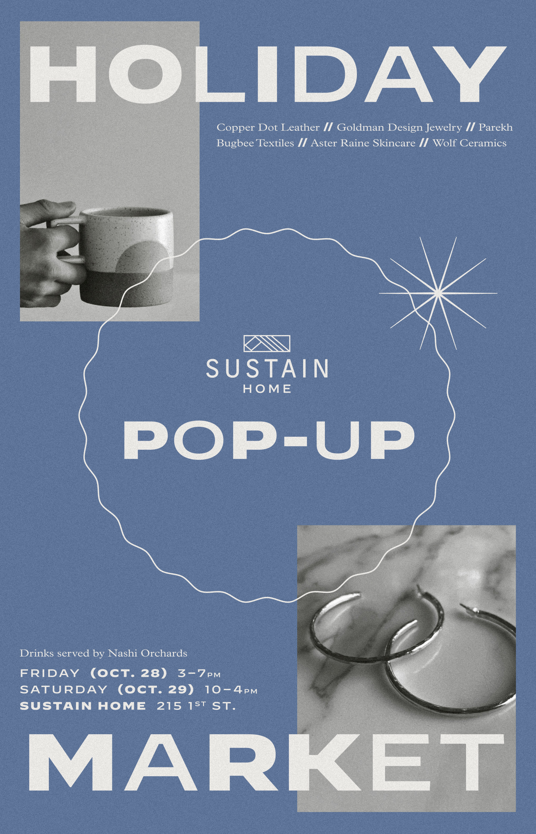
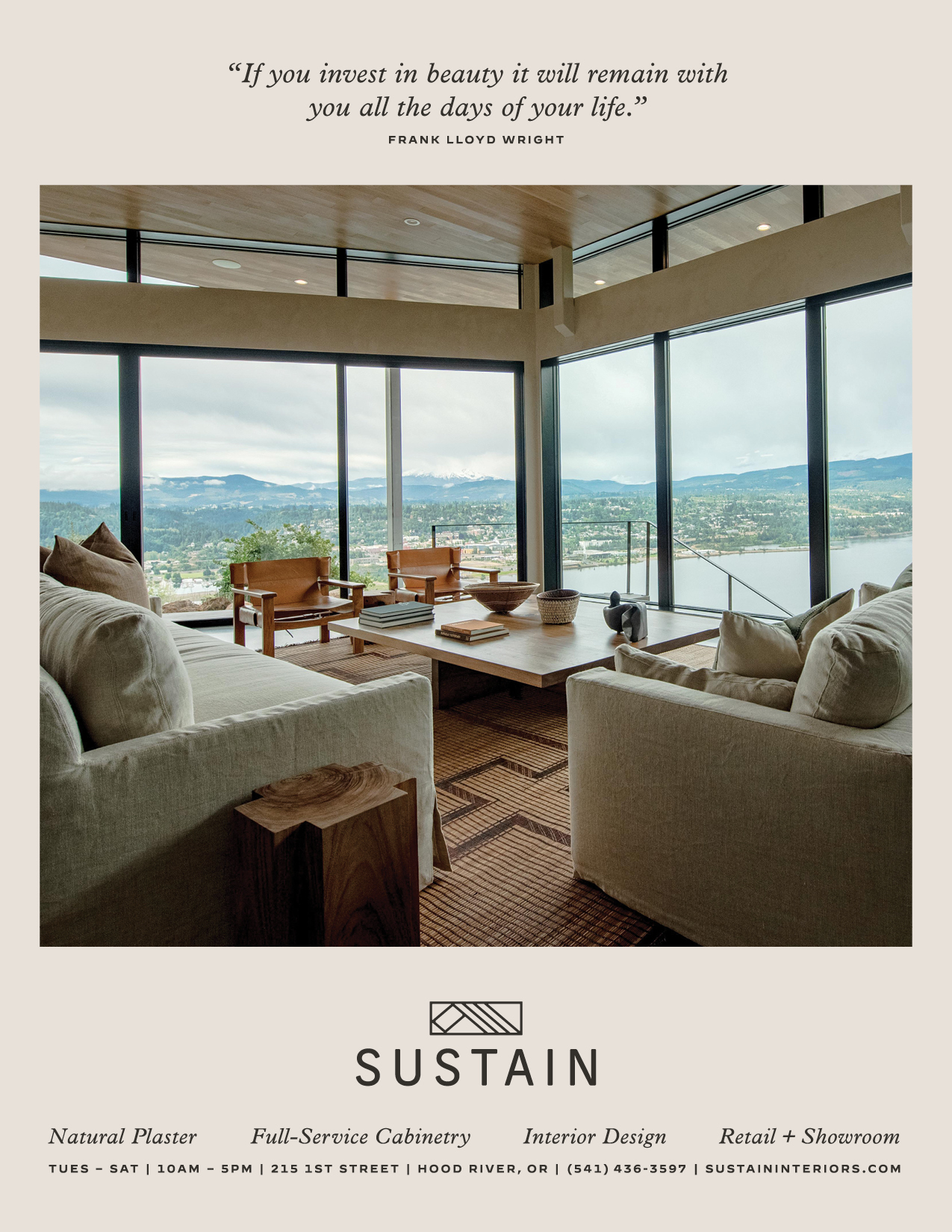
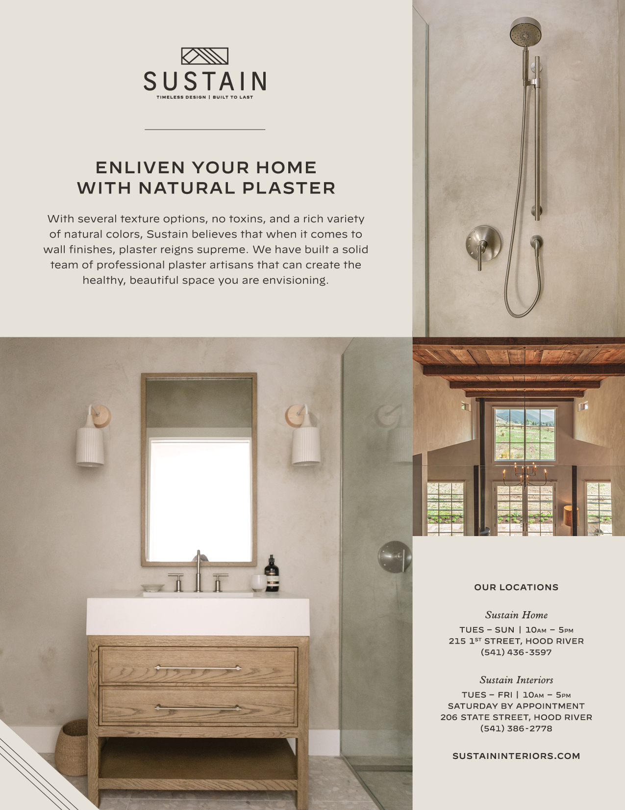
Sustain is an all-encompassing team of skilled designers, craftsmen, builders, and project managers. At the core of their practice is an instinct to design and build beautiful things that will be cared for and preserved. They specialize in full-service interior design, general contracting, plaster, cabinetry, and even have a retail shop full of high end furniture, accessories, and locally made art.
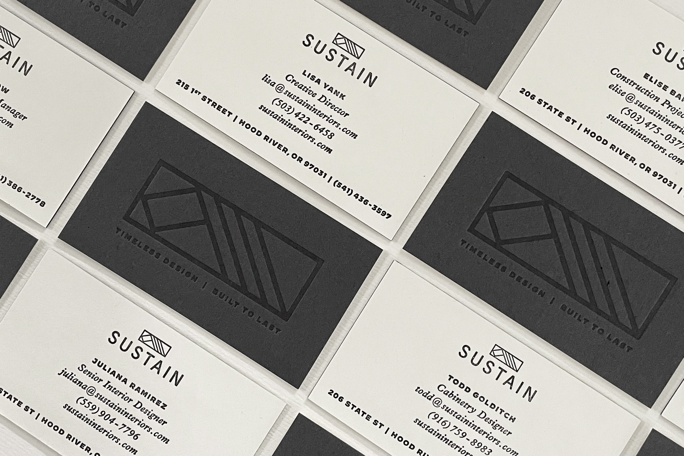
What started as an overhaul of their brand identity – including a redesigned logo, tagline, and website – has turned into a robust ongoing client relationship. Over the past couple years I’ve had the pleasure of being an integral part of the Sustain team as their go-to graphic designer, collaborating with them on countless creative projects as they’ve become a trusted source in our local community for all things art, design, and home.











Gateway U
New Jersey is full of people who are working hard to make a living while earning their degree.
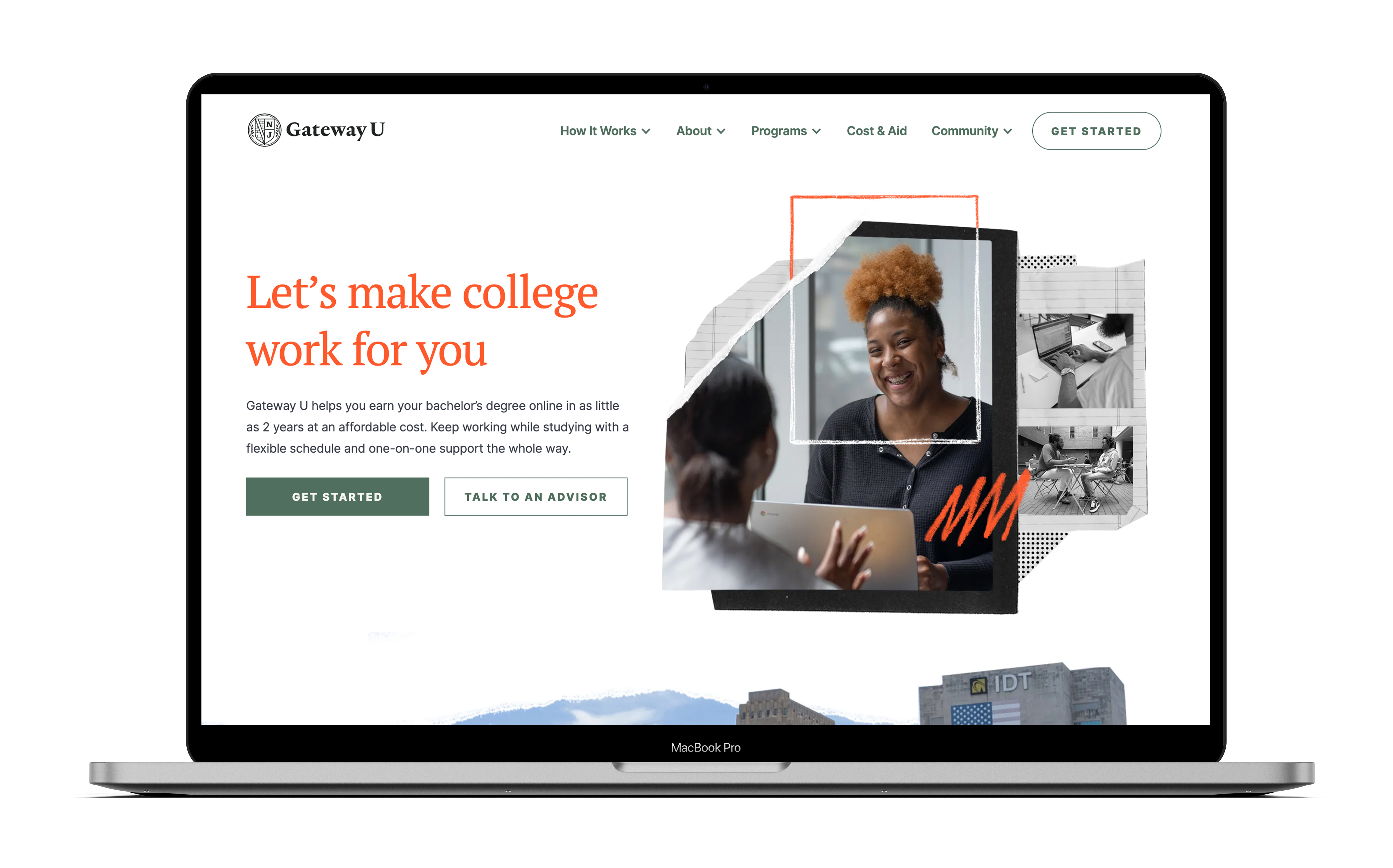
Gateway U helps traditionally underserved students earn a bachelor’s degree online in as little as 2 years, at an affordable cost, and with a flexible schedule and one-on-one support the whole way. Based in Newark, New Jersey, they believe all motivated students should be able to earn a career-boosting college degree without going into debt or putting their life on hold.


The Gateway U logo is inspired by traditional college crests, conveying legitimacy and trust. The brick pattern represents and celebrates Newark’s nickname, “Brick City.”


Photo collages were created as the hero photography treatment that are used on the website, social, and marketing collateral. This photo concept leans into the metaphor of the “Gateway”, as not just the organization’s namesake, but also as a means of depicting change. While honoring and finding inspiration from the city’s past, Gateway U students are mapping themselves to an ever-evolving city, as they too advance their education. These photo collages celebrate the process of taking steps forward towards their individual growth.
Visit gatewayunewark.org
Photography by Chrys Davis
Project completed in collaboration with Jacob Mazonson
Photography by Chrys Davis
Project completed in collaboration with Jacob Mazonson
Pulp Mag
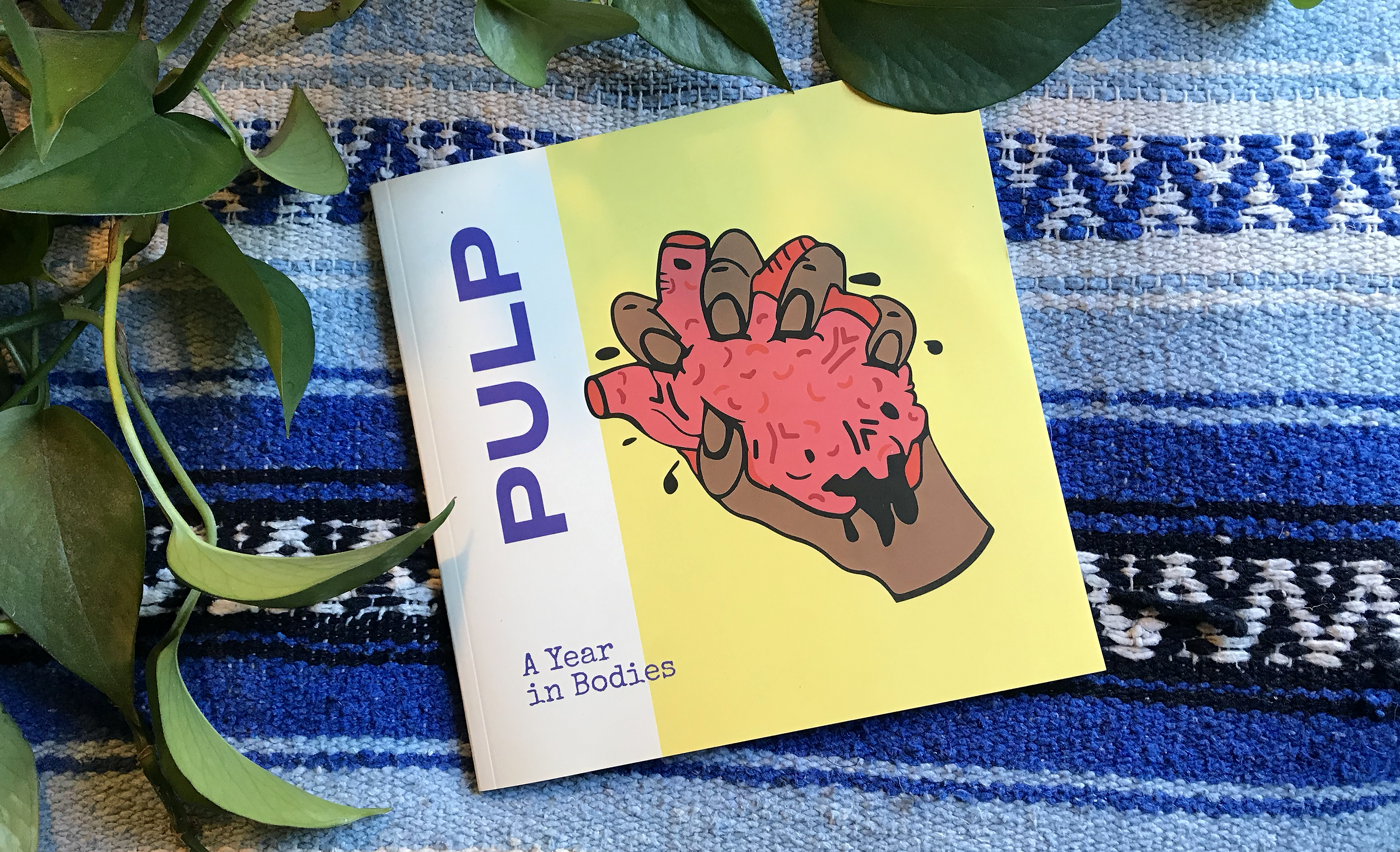
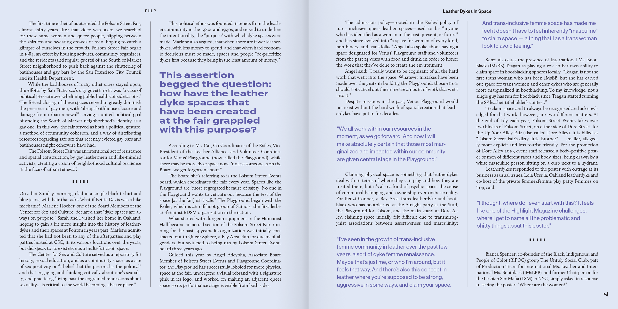
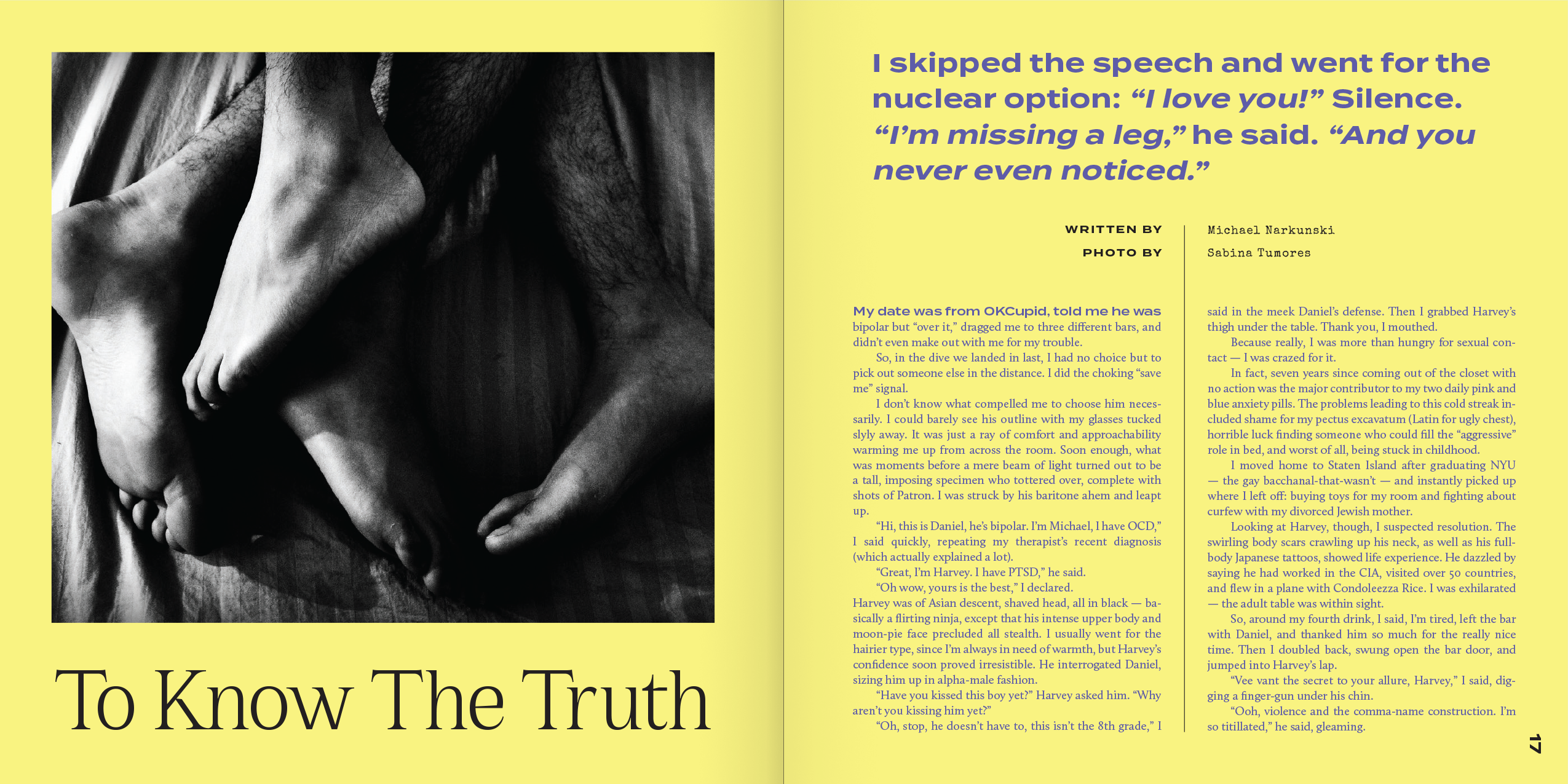
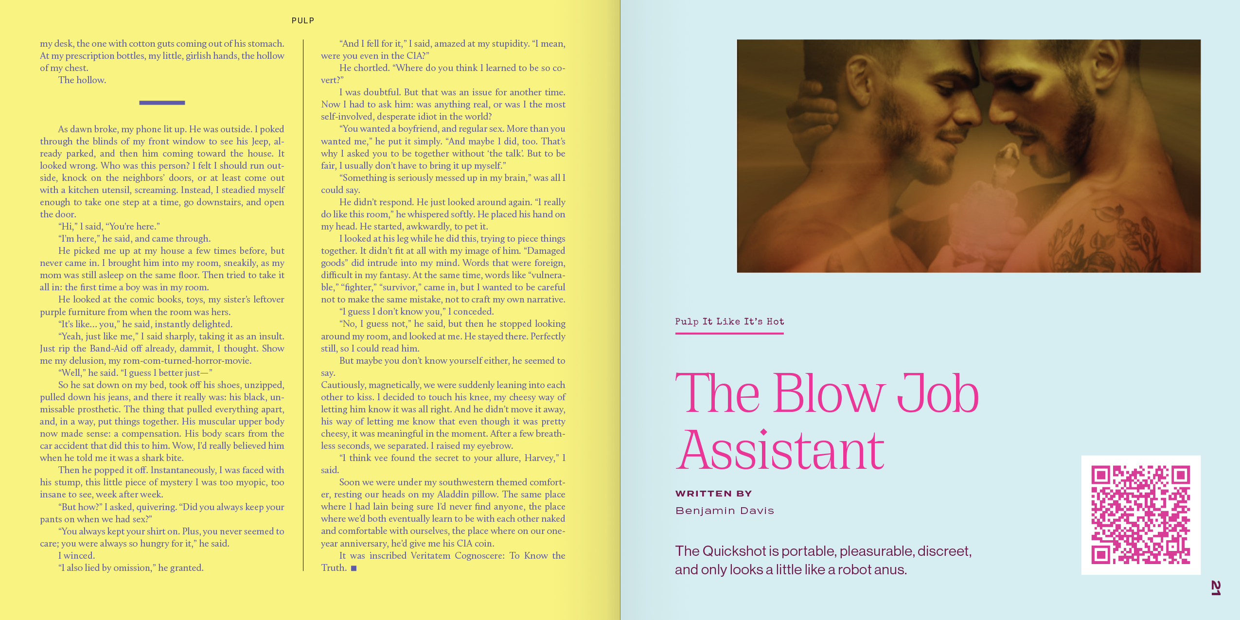
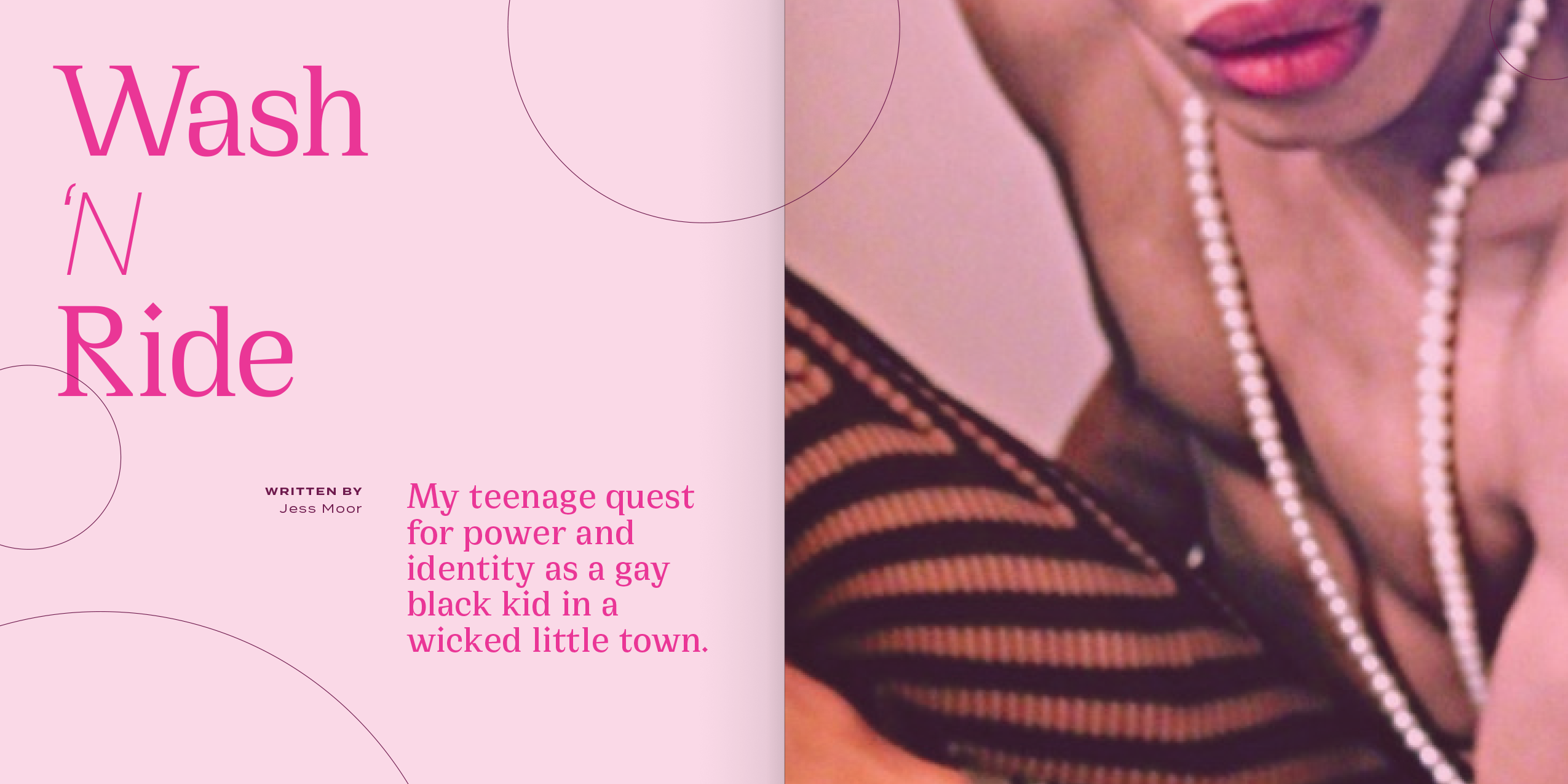
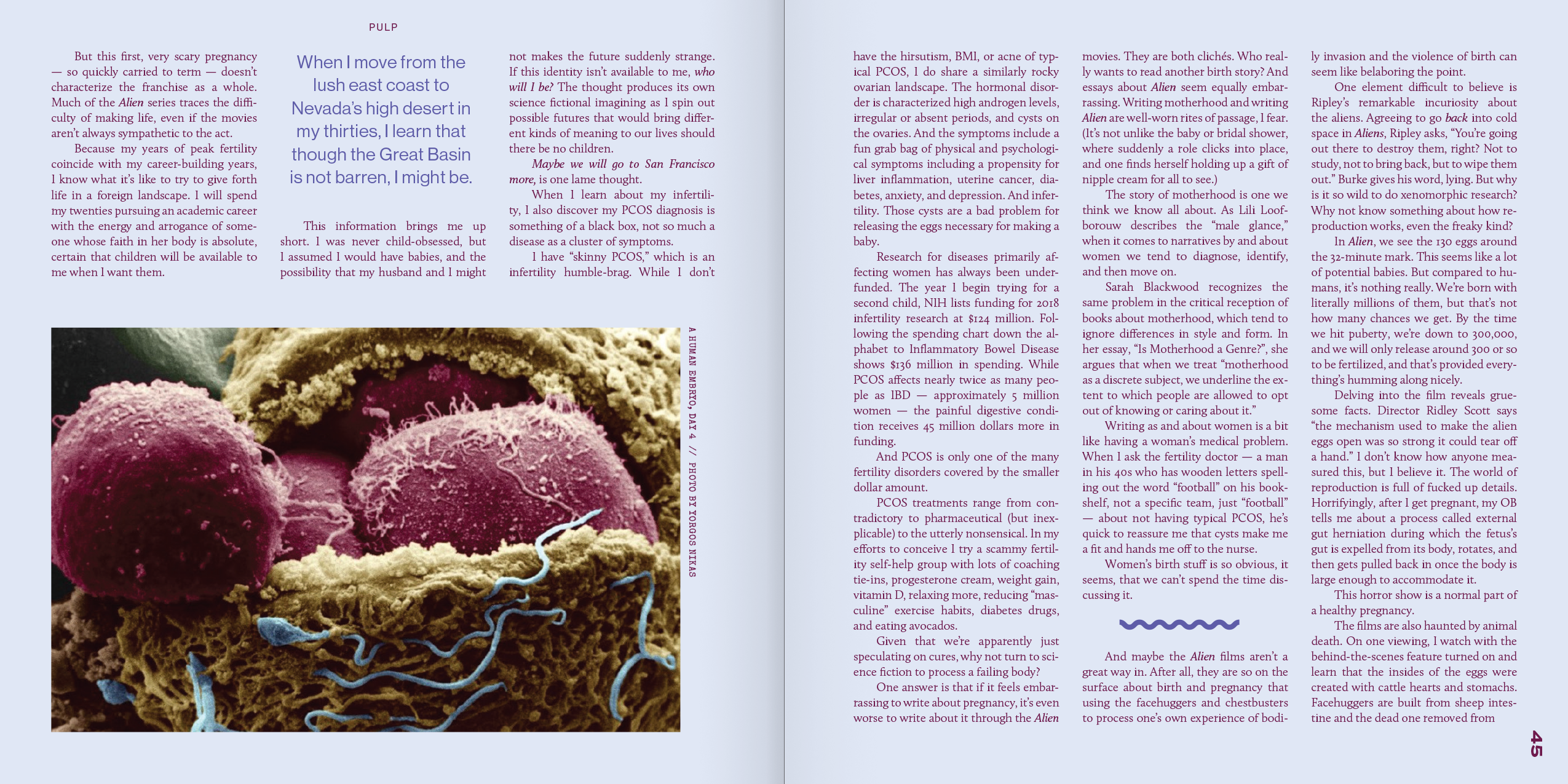
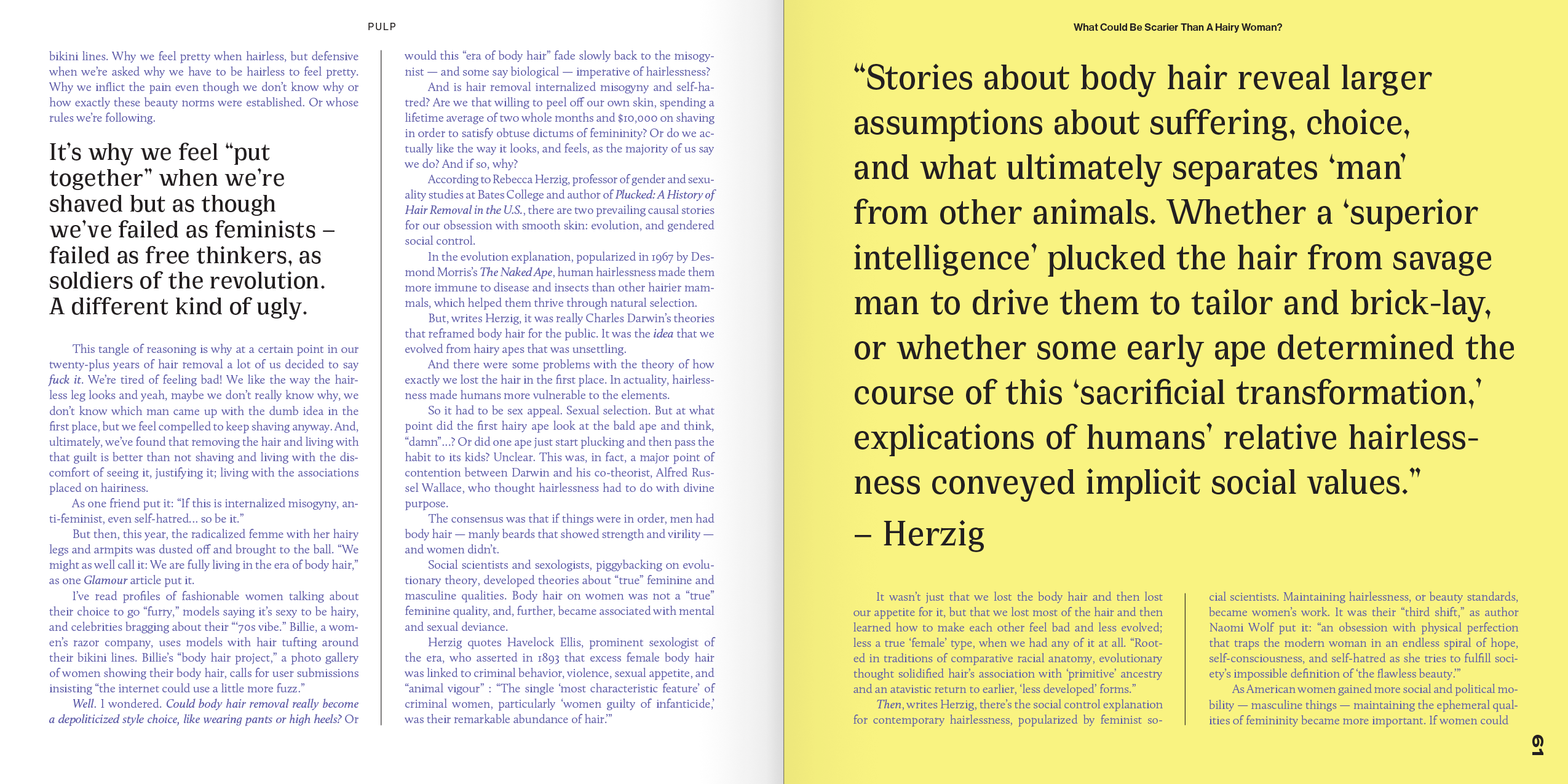
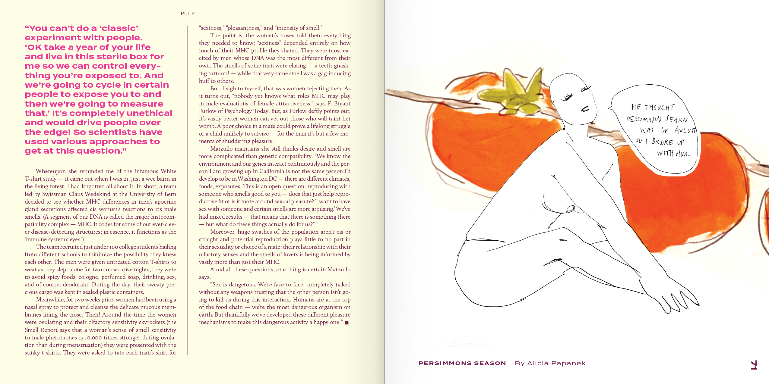
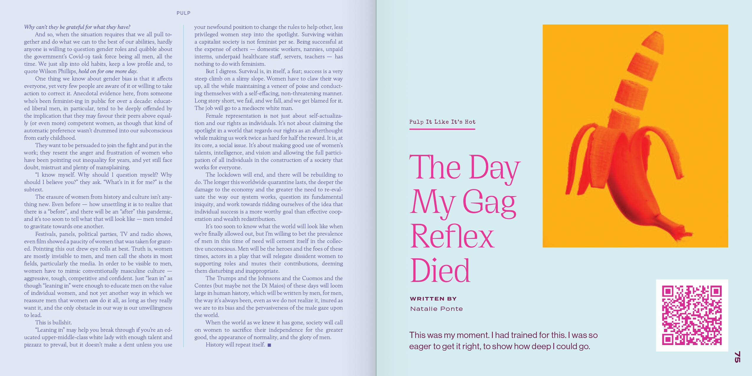
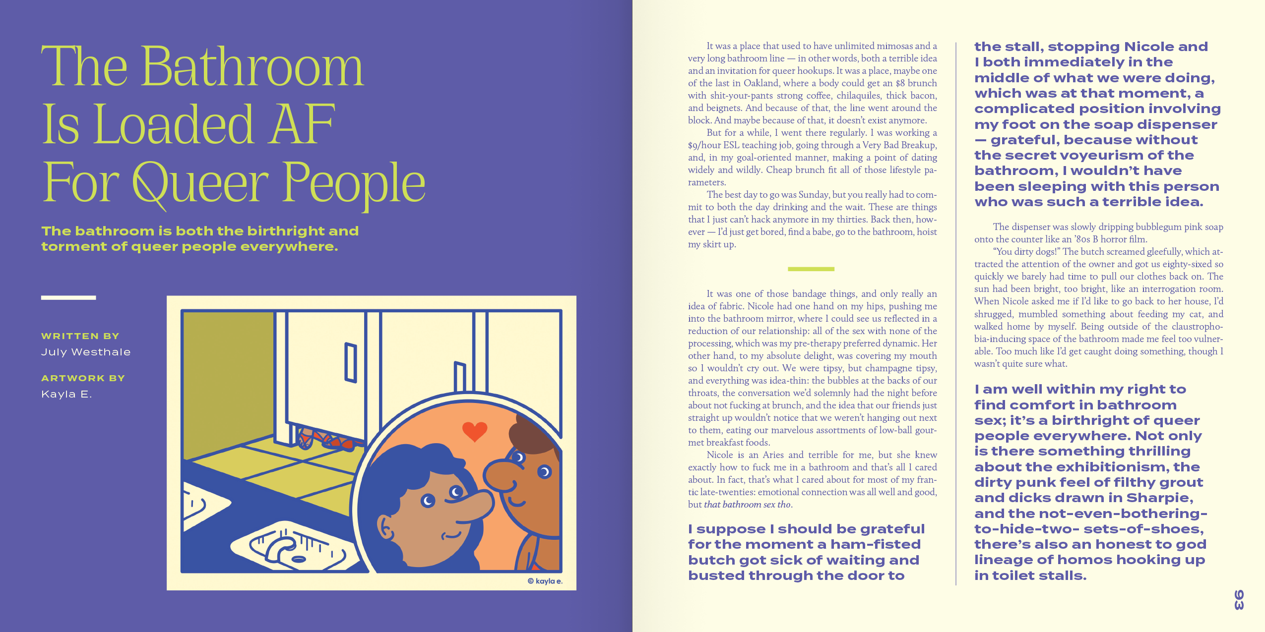
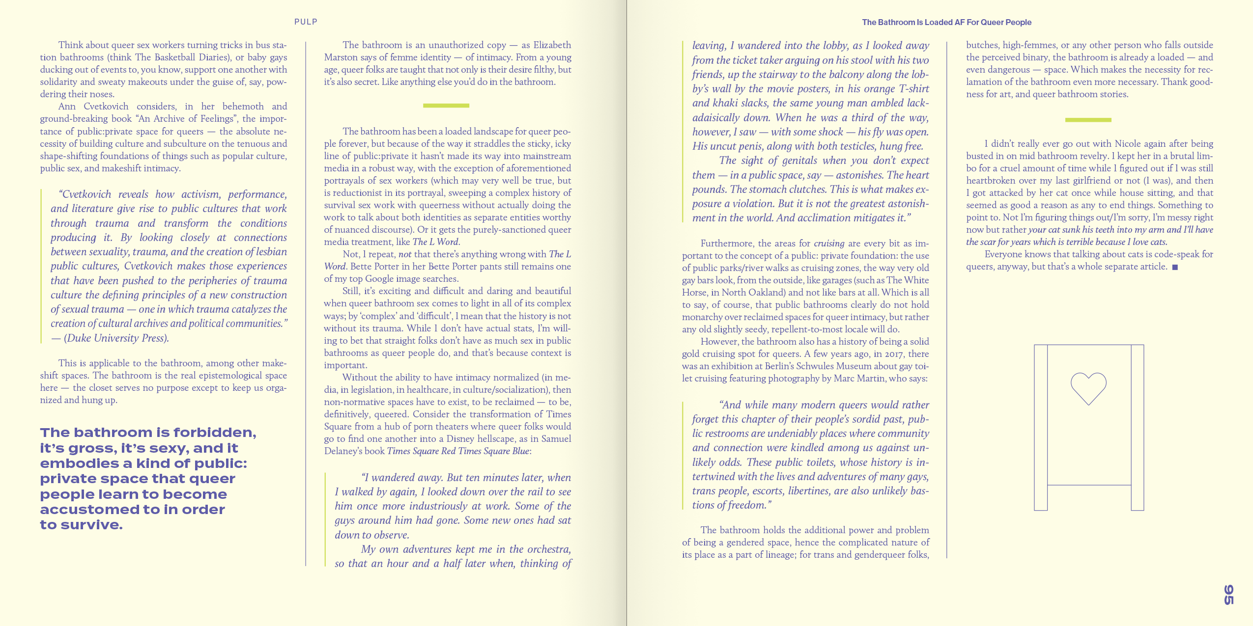
PULP is a multimedia sex, sexuality, and reproductive rights publication. Covering all topics surrounding the body, it is committed to sharing stories and voices that have been marginalized or shamed by mainstream media and culture. They recently launched a Kickstarter campaign to help raise funds for the launch of PULP Public School (PPS) — an online school featuring classes, readings and events. I had the pleasure of creating a coffee table book as a gift to donors. The book highlights sixteen articles from the past year and features original illustrations by creatives across the U.S.



Check out more from PULP here